Why Do We Hate Pie Charts?
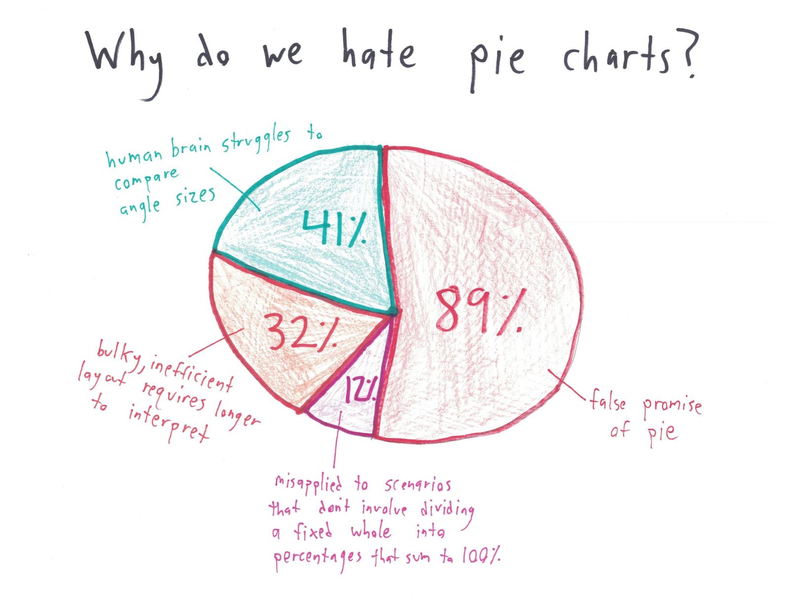
A pie chart of reasons to hate pie charts whose percentages add to 174%, illustrating its own last complaint.
Use this cartoon
Free for classrooms, worksheets, slides and other non-commercial use under CC BY-NC 4.0, with credit to Ben Orlin.
Cartoon by Ben Orlin, Math with Bad Drawings. https://cartoons.mathwithbaddrawings.com/2021-01-01-why-do-we-hate-pie-charts/ (CC BY-NC 4.0)Transcript
[Title] "Why do we hate pie charts?" [Pie chart] false promise of pie: 89% · human brain struggles to compare angle sizes: 41% · bulky, inefficient layout requires longer to interpret: 32% · misapplied to scenarios that don't involve dividing a fixed whole into percentages that sum to 100%: 12%