Why Not to Trust Statistics
Six set-up/punchline pairs showing how each summary statistic can mislead: a mean inflated by the CEO's son, a median hiding huge losses, a mode hiding a bad average, a range hiding a skewed distribution, a correlation driven by two paid athletes, and 'variance' that is really one outlier.
Use this cartoon
Free for classrooms, worksheets, slides and other non-commercial use under CC BY-NC 4.0, with credit to Ben Orlin.
Cartoon by Ben Orlin, Math with Bad Drawings. https://cartoons.mathwithbaddrawings.com/2016-07-13-why-not-to-trust-statistics/ (CC BY-NC 4.0)Transcript
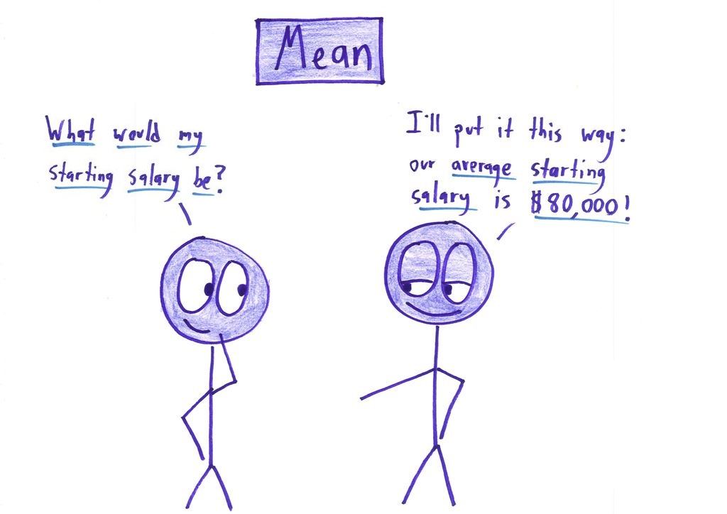
[1] Mean: "What would my starting salary be?" "I'll put it this way: our average starting salary is $80,000!"
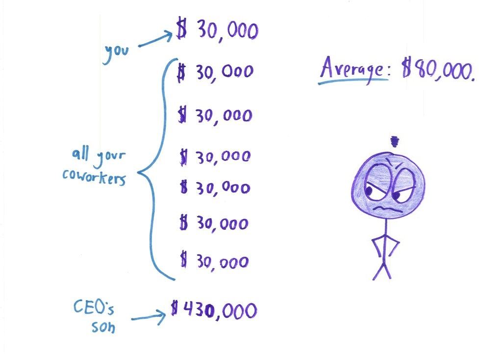
[2] you → $30,000; all your coworkers: $30,000 ×6; CEO's son → $430,000. Average: $80,000. [angry figure]
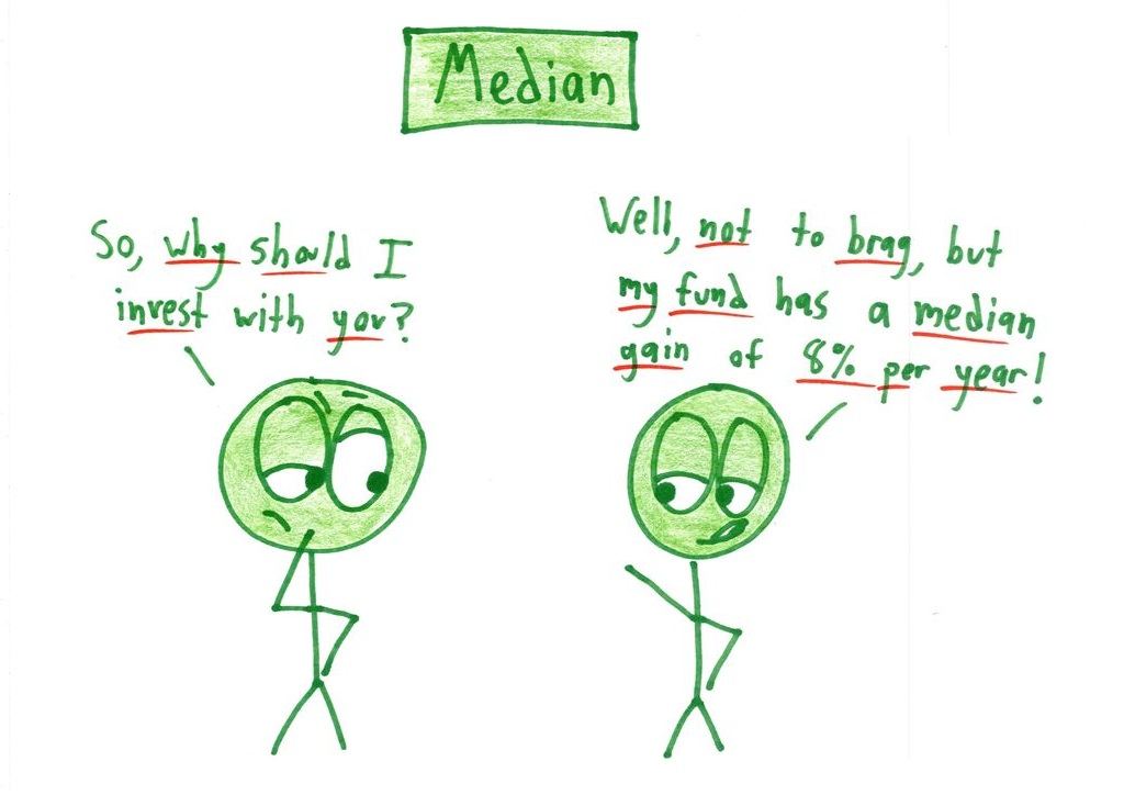
[3] Median: "So, why should I invest with you?" "Well, not to brag, but my fund has a median gain of 8% per year!"
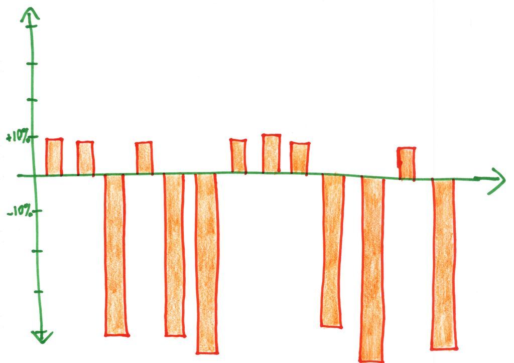
[4] [Bar chart of yearly returns: small gains around +8%, huge losses below −10%]
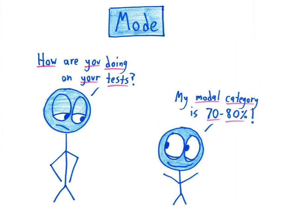
[5] Mode: "How are you doing on your tests?" "My modal category is 70–80%!"
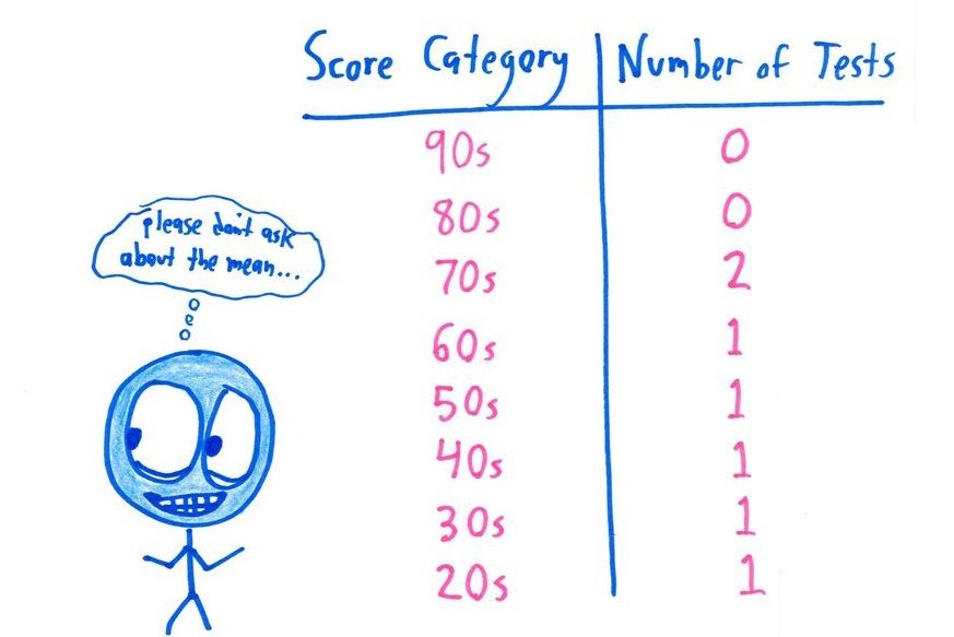
[6] Score Category | Number of Tests: 90s 0, 80s 0, 70s 2, 60s 1, 50s 1, 40s 1, 30s 1, 20s 1. (thinks: "please don't ask about the mean…")
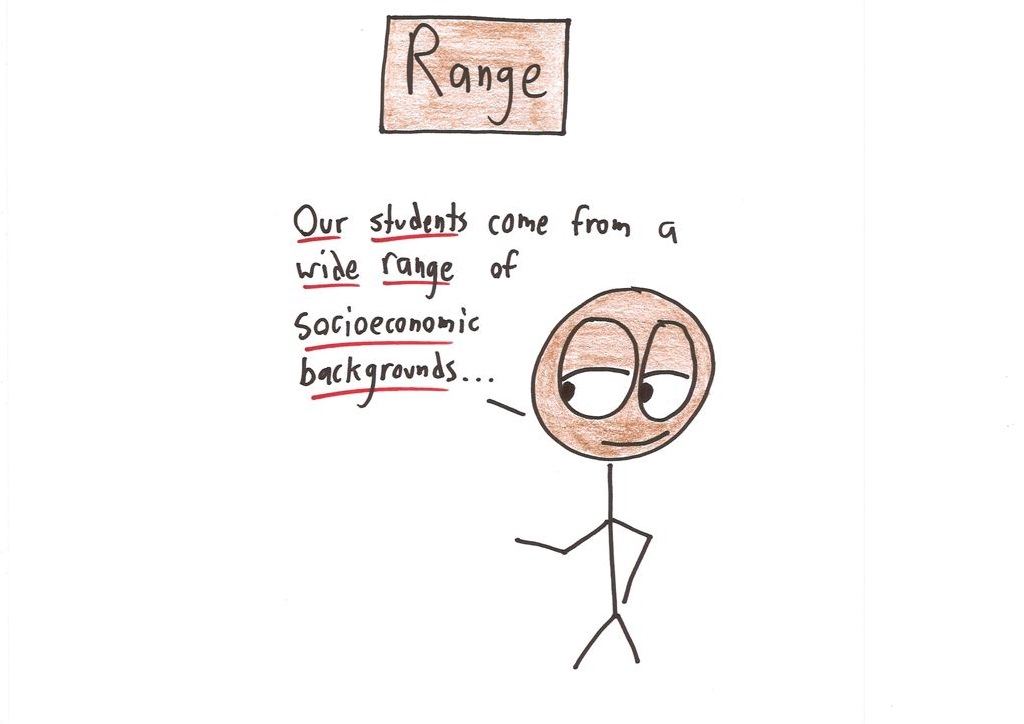
[7] Range: "Our students come from a wide range of socioeconomic backgrounds…"
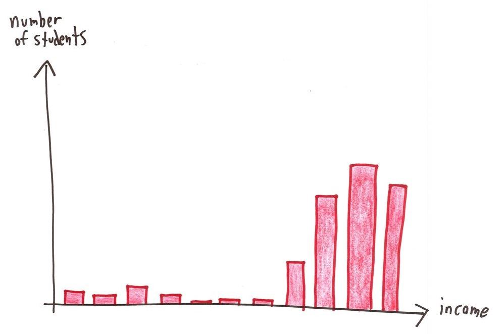
[8] [Histogram: number of students vs. income: a few low-income students, most clustered at high income]
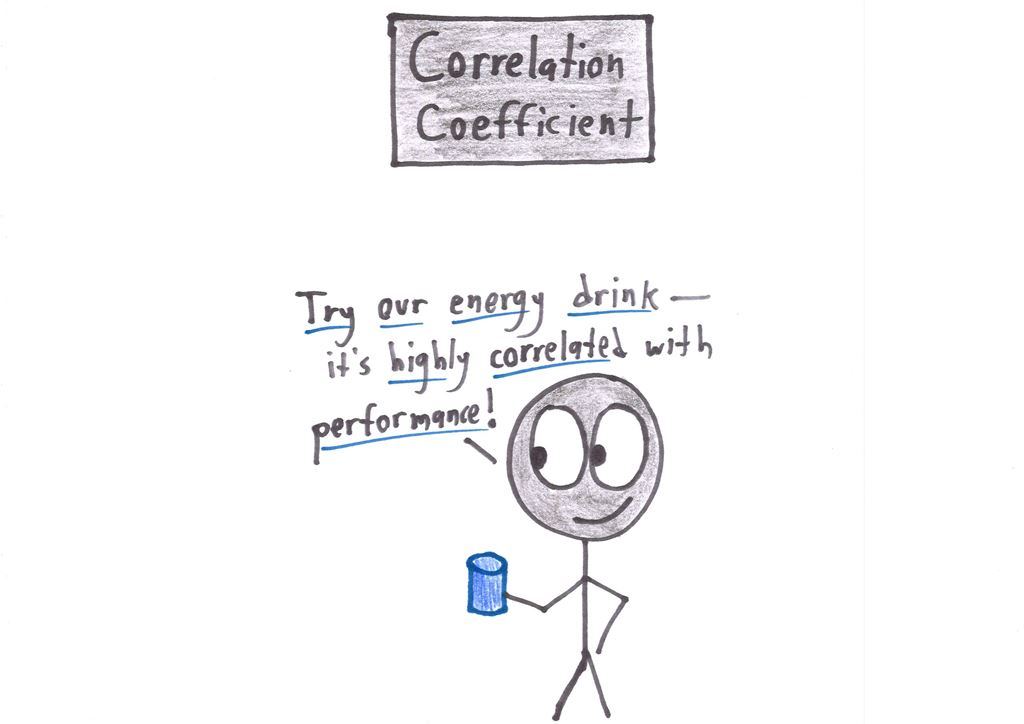
[9] Correlation Coefficient: "Try our energy drink—it's highly correlated with performance!"
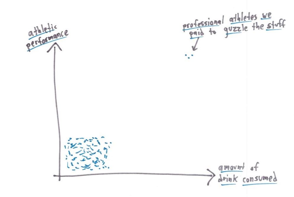
[10] [Scatter plot: athletic performance vs. amount of drink consumed: a cluster of low/low dots plus a couple of "professional athletes we paid to guzzle the stuff" far up and right]
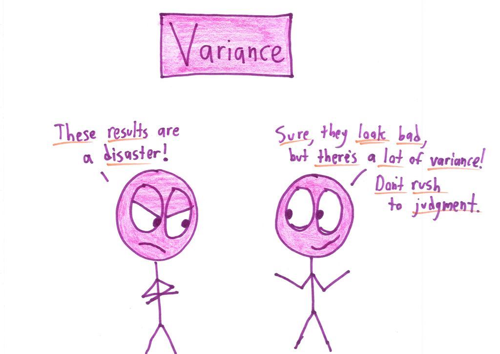
[11] Variance: "These results are a disaster!" "Sure, they look bad, but there's a lot of variance! Don't rush to judgment."
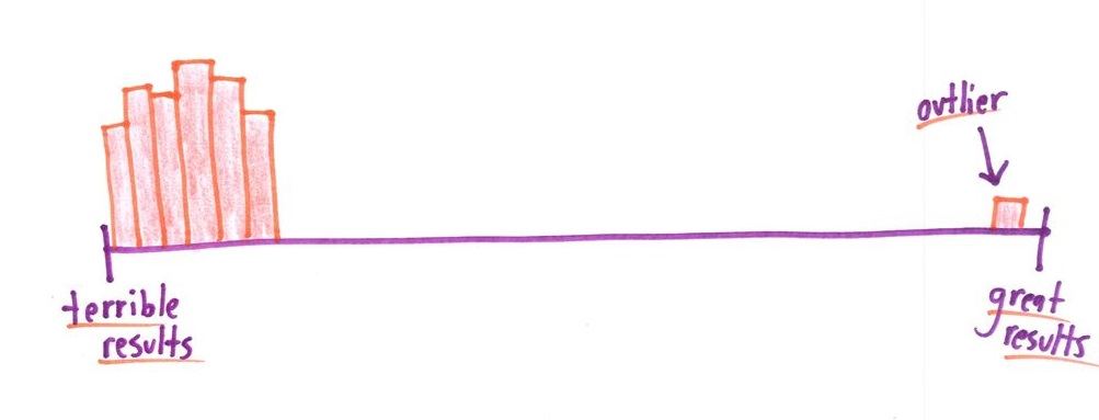
[12] [Distribution: almost everything at "terrible results," one "outlier" at "great results"]